Designing Forms
You can design a custom form for an artifact. The custom form will be available in all the child artifacts of the artifact.
To design your own custom forms, follow these steps:
- Go to Application Menu > Miscellaneous > Settings > Requirements Manager.
- Under the Specification Templates Workspace pane, click the required artifact.
- Click the Form Designer tab.
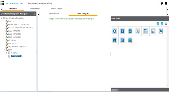
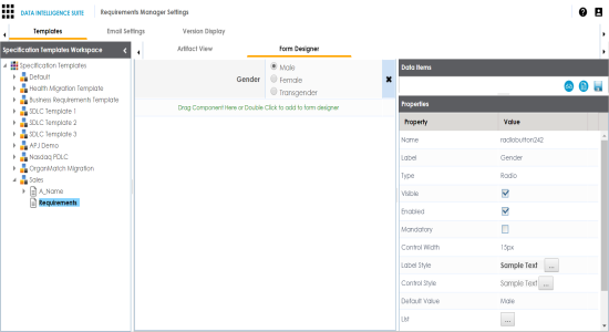
The Form Designer tab contains the following sections- Data Items: This pane displays the available UI elements.
- Properties: This pane displays the properties of the selected UI element in the form designing space.
- Double-click or drag and drop the required UI elements from the Data Item pane to the form designing space.
- Select UI elements, one at a time, and configure their properties in the Properties pane.
- Draft
- Ready for review
- Approved
- Use
 to control:
- Form Label Width
- It enables you to modify width of the label in % specific to window.
- Form Control Width
It enables you to modify width of the control option in % specific to window.
- Click
 to preview.
 - Click
 .
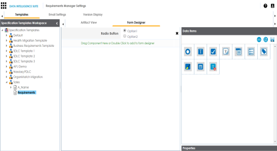
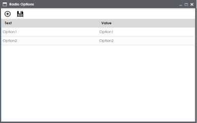
. - Double-click or drag and drop the Radio Button icon from Data Items to the space provided to design the form.
- Click the cell containing Option 1.
- Double-click the Value cell corresponding to Label and edit it to change the Label.
- Click
 against the List to edit radio options.
 - Double-click Option 1 and edit it. Similarly, to edit Option 2 text in the form double-click Option 2.
- Click
 to add more options.
 - Double-click the cells to enter the option.
- Click
 .
. - Click .
- Click to preview.
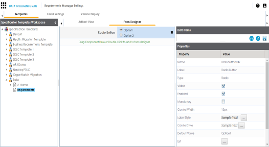
Note: The available properties differ based on the type of UI element.
Refer to the following table for property descriptions:
|
Property |
Description |
|---|---|
|
Name |
Specifies the name of the form field. For example, combobox260. You can change it as per your requirements. |
|
Label |
Specifies the information of this field. For example, Status. |
|
Type |
Specifies the type of form field. For example, Combo Box. Double-click the corresponding value cell to select an option. |
|
Visible |
Specifies whether the field is visible in the form. Select the Visible check box to make the field visible in the form. |
|
Enabled |
Specifies whether the field is enabled in the form. Select the Enabled check box to make the field enabled in the form. |
|
Mandatory |
Specifies whether the field is mandatory in the form. Select the Mandatory check box to make the field mandatory in the form. |
|
Control Width |
Specifies the width of the control option. For example, 95%. Double-click the corresponding value cell to change it. |
|
Label Style |
Specifies the label text style of the field. Click |
|
Control Style |
Specifies the text style. Click |
|
Default Value |
Specifies the default value of the field. For example, draft. Double-click the corresponding value cell to change it. |
|
List |
Specifies the list of values applicable for this field. For example: Click |
 to select a text style.
The Master Template Option is saved.
Take an example of radio button:
You can view the properties of the data item.
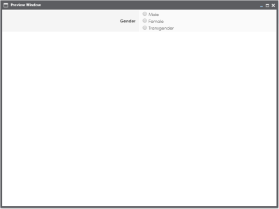
For example, we changed it to Gender and the form appears as shown below.
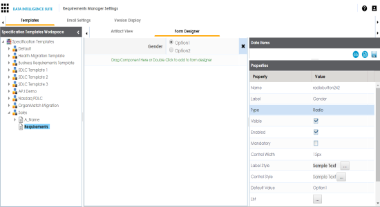
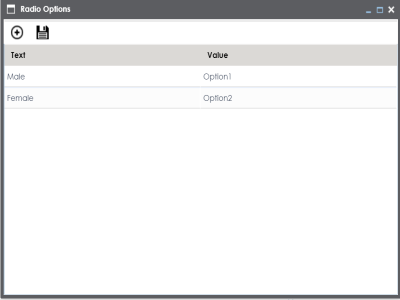
We edited Option 1 text and Option 2 text and entered Male, and Female respectively.
One row is added.
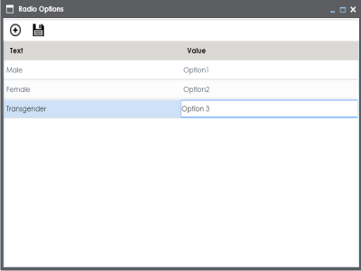
The options in the form are modified.
The Master Template Option is saved.
The Preview Window appears.
|
Copyright © 2020 erwin, Inc.
All rights reserved.
|
|