Configuring Asset Form
Assets are the business assets (business terms, business rules, business policy, and so on) that you work on in the Business Glossary Manager, and marketplace assets (datasets) in the Data Marketplace module. For each asset type, apart from its default properties, you can configure custom properties. To do so, design a form and configure the custom properties on the <Asset Type> tab. By default, all the settings open in the read-only mode.
The following steps walk you through configuring asset forms for business assets. Similarly, you can configure asset forms for marketplace assets.
To design a form and configure custom asset properties, follow these steps:
- On the <Asset Name> tab, click Edit.
For example, click Edit on the Business Term tab.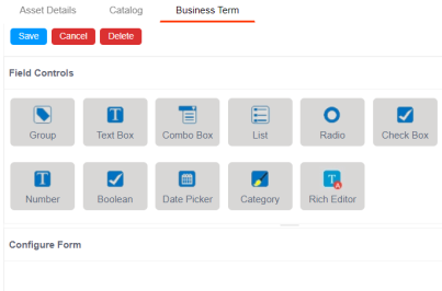
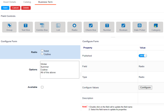
The <Asset Name>, tab contains the following sections:- Field Controls: This pane displays the available UI elements.
- Configure Form: This pane is the canvas where you design the form using the UI elements available in the Field Controls pane.
- Properties: This pane displays the properties of the UI element selected in the Configure Form pane.
- Drag and drop the required UI elements from the Field Controls pane to the Configure Form pane.
- Select UI elements, one at a time, and configure their properties in the Properties pane.
The available properties differ based on the type of UI element.
Refer to the following table for property descriptions: - Default Connector: Use this option to enter option values manually or using an XLSX file.
- Reference Data Manager: Use this option to pull option values from reference tables in the Reference Data Manager.
- Filter feature supports field types such drop-down, list, checkbox, radio, and boolean.
- Switch the Include Extended Properties option ON on the Discover Asset Settings page.
- Schedule a synchronization job or manually synchronize the asset before you can filter assets on the Discover Assets module.
- Once, you have designed the form and configured the properties of all the UI elements, click Save.
The changes you made are available on the asset creation page in the Business Glossary Manager. For more information on creating business assets, refer to the Using Business Glossary Manager topic.
|
Property |
Description |
|---|---|
|
Published |
Switch Published to ON to publish the field. |
|
Field |
Set the element label. |
|
Type |
Select the element type. By default, it is set to the element that you added. However, you can change the type using this property. |
|
Dependencies |
Some elements depend on the values of other elements on the form. Select the elements on which your element depends. This property is available for List, Radio, Boolean, and Date Picker elements. Parent elements must be placed first in the form. |
|
Configure Values |
Click to configure the possible values available in an element. You can add custom values or select the data available in your environment. For example, the list available in a Combo Box. Use the following options:
|
|
Mandatory |
Select whether documents can be attached to the asset type. |
|
Regular Expression |
Define a regular expression that must be fulfilled for the text entered in the text box. For example, a password text box should be validated for the correct password format. In that case, the regular expression would define the password criteria. |
|
Description |
Enter the description of the element. |
|
Visible in Form |
Switch Visible in Form to ON to make the field visible on the form. |
|
Visible in Grid |
Switch Visible in Grid to ON to make the field visible in the grid. |
|
Use in Discover Assets |
Switch Use in Discover Assets to ON to use the field as a filter in the Discover Assets module. Ensure the following:
|
|
Order |
Specifies the order of the field on the Extended Properties tab. To enter the order number, double-click the corresponding Value cell. You can also drag and move fields in the Configure Form pane to change their order. For example, if there are four elements on the page and the selected element must appear as the third element, set the order to 3. |
The following image shows a sample catalog creation form with radio button, combo box, checkbox, and list.
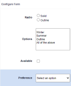
- Select the Preference element.
Its properties appear in the Properties pane.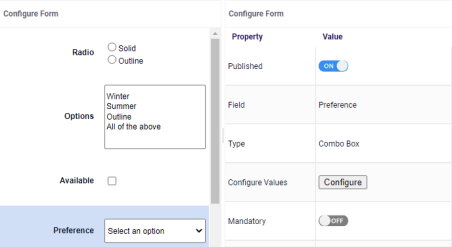
- Click Configure.
The Combo Box Options page appears. Use this page to add items to the Preference combo box list.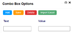
- Click Add.
Rows are added to the grid on the page. - Double-click cells in the grid to edit them.
- Enter values under the Text and Value columns in each row.
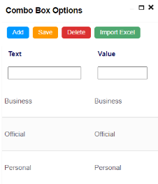
- Click Save.
The list you added in Step 5 appears in the Preference combo box. The following image shows the Preference combo box with the list.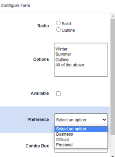
|
Copyright © 2026 Quest Software Inc. |